Despite the lack of determination, as was the case with the transition to iOS 7, Apple undoubtedly follows the course of developing a new design in iOS eleven. If in iOS 7 approach in interface design was minimalism and modesty of elements, then in iOS 11 everything is the other way around – maximalism and self-confidence. In applications and service windows, we see a reduction in information content, large, enlarged headings of search windows and bolder typography in everything.
![iOS - 11-wide-featured-1 [1]](/wp-content/uploads/images/ios_11_vs_ios_10_izmeneniya_dizajna_polzovatelskogo_interfejsa_v_ios_11_ith.png)
But there are also more refined design changes. Here's a list of the UI design changes iOS 11, compared to iOS 10. The screenshots on the left are from iOS 10, and the screenshots on the right are iOS 11.
- iOS 10 vs iOS 11: Visual interface changes
- 1.Combine Lock Screen and Notification Center
- 2. Current track on the lock screen
- 3. Unlock animation
- 4. Home screen
- 5. Redesigned Control Center
- 6. Drawer for iMessage apps
- 7. Redesigned design App Store
- 8. Updated interface Siri
- 9. Redesigned 'Phone' application
- 10. Redesigned app 'Calculator'
- 11. Application interface 'Video'
- 12. Redesigned app 'Settings'
- 13. Redesign of the status bar
- 14. Improved design elements of the 'Notes' application
- 15. Improved design elements of the Safari application
- 16. Improved design elements of the 'Calendar' application
- 17. Section on disk space management
- 18. Application panel in iPad
- 19. 'Slide Over' mode on iPad
- 20. Switch between applications on iPad
iOS 10 vs iOS 11: Visual interface changes
1.Combine Lock Screen and Notification Center
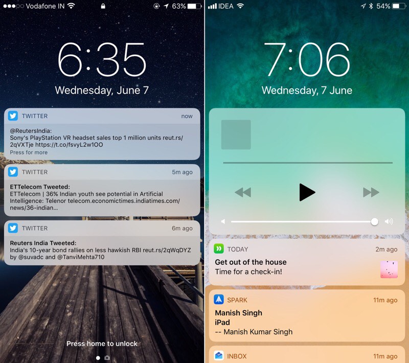
When you turn on the device, we are greeted by probably the most noticeable design detail iOS 11 compared to iOS 10. When switching to iOS 10 Apple made a splash, when it introduced a completely redesigned lock screen. In iOS 11, they applied something different, at the moment something confusing and discouraging.
Cupertinos decided to combine the Lock Screen with the Notification Center into a single whole. Thus, the lock screen displays all notifications that were received while the device was locked. Swipe up in the middle of the screen to view all previous notifications.
Too many swipe gestures, and I really don't like the idea of combining two utility functions on one screen. I hope that within the next three months the specialists Apple will finalize this concept before the release of the final version iOS.
2. Current track on the lock screen
Now, when you listen to music, the current track is displayed on the Lock Screen (in fact, on the Notification Center screen) as an information card and does not take up the entire screen space.
Thus, it becomes possible to view the received notifications, even if at this moment you are listening to your music tracks. Swiping with a gesture can also view all notifications from history.
3. Unlock animation
iOS 11 introduces the first animation when unlocking the device. When you press the Home button, the lock screen pops up like a curtain, giving you access to the home screen. And since now the Lock Screen is combined with the Notification Center, such an animation is quite appropriate.
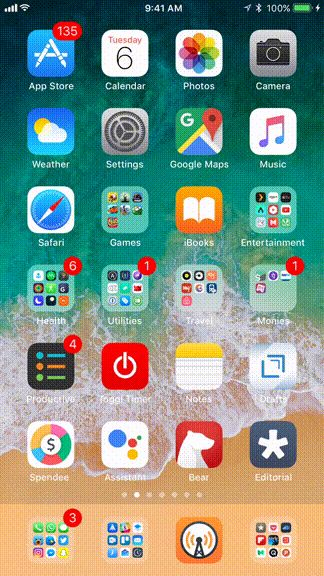
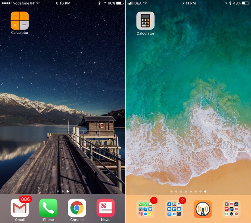
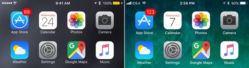
4. Home screen
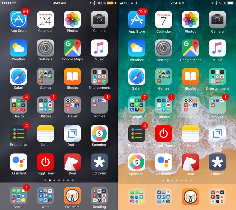
The Home Screen hasn't undergone any significant changes, but they are. First of all, new wallpapers and new icons in the status bar. The most obvious difference is that the app and folder names in the dock are gone. Thanks to this, we managed to reduce the dock height by a couple of pixels.
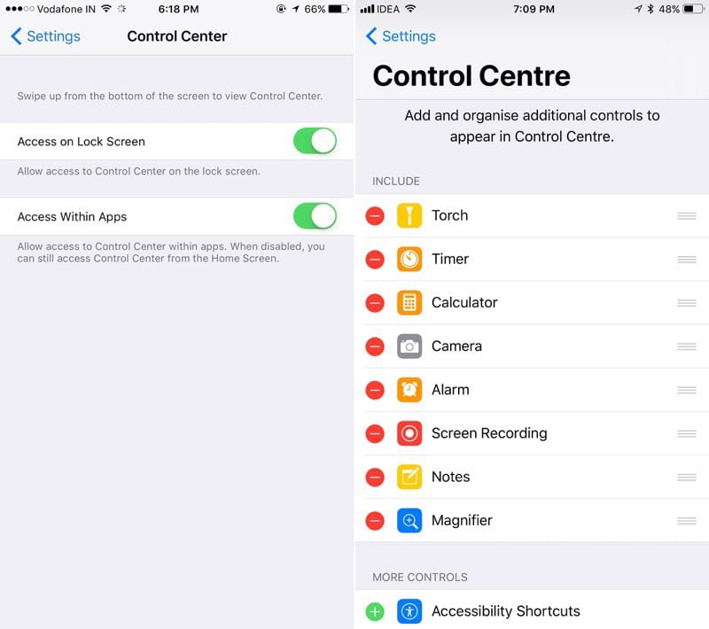
5. Redesigned Control Center

Thank you very much for coming back to the idea of placing all the elements of the Control Center on one page. The buttons are now located on a dark background, the Center itself occupies the entire screen, and the controls in the form of tiles have received support 3D Touch and, when pressed harder, can now display more detailed information or advanced options of a function.
6. Drawer for iMessage apps

Apple redesigned iMessage apps drawer. It is now easier to find and use. Apps appear as icons at the bottom of the conversation, which expand when you click on them. You can scroll them with a swipe gesture, and by clicking on the icon, you can launch the selected application.
7. Redesigned design App Store
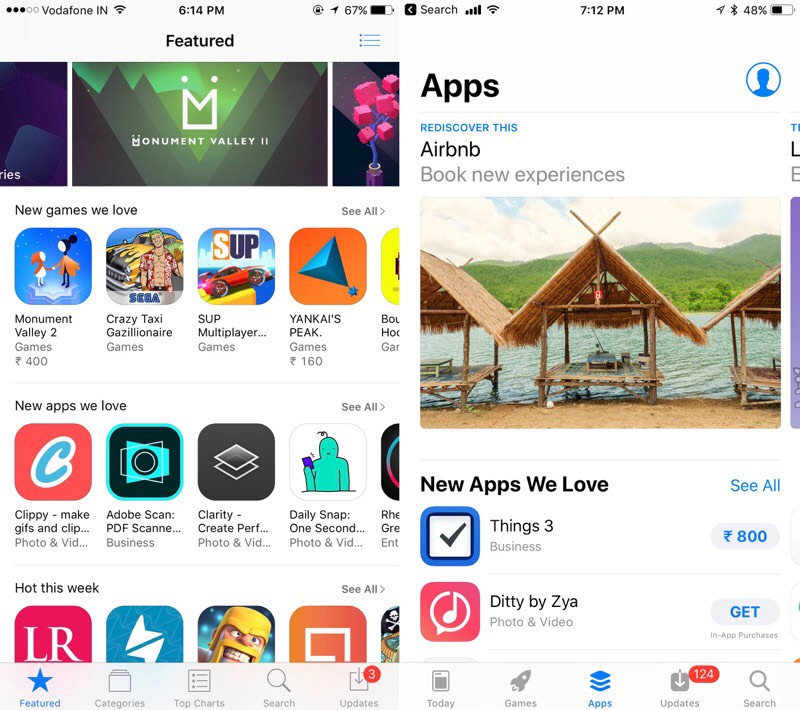
The app App Store has been completely redesigned and now looks more like the app Apple Music. Less informative, larger icons and visuals.
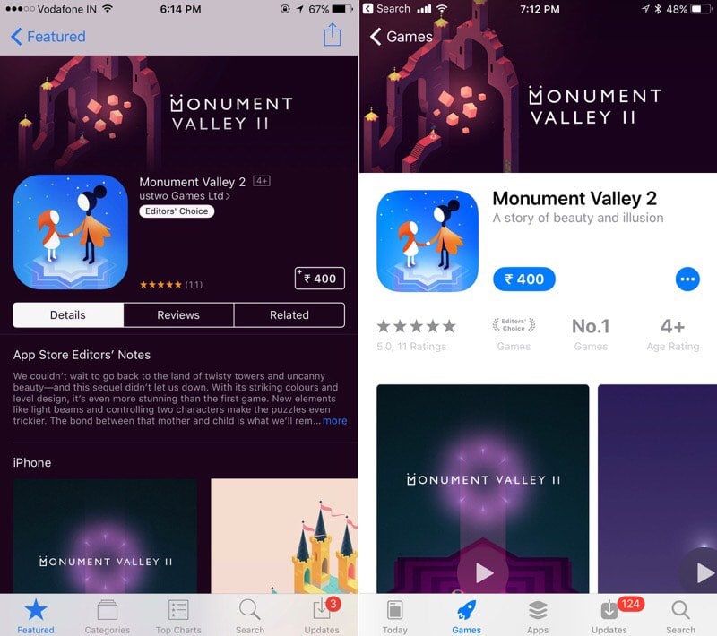
There are also new separate tabs – 'App of the Day', 'Games' and 'Apps'.
8. Updated interface Siri
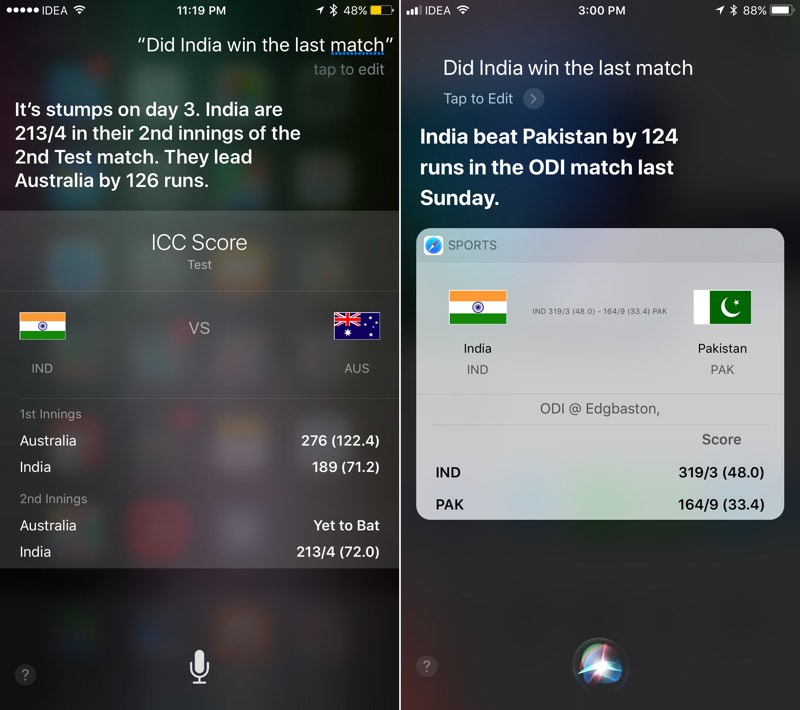
The user interface has changed significantly Siri. The text and updated answers are now positioned closer to the left. The text size itself has been increased and now Siri shows multiple answer options instead of one. There is also a more intelligible button for editing a user-asked question.
9. Redesigned 'Phone' application

Similarly, the design of the 'Phone' application has been significantly redesigned. It now has larger titles and bold titles. There is more space between the interface elements and are now easier to read.
10. Redesigned app 'Calculator'
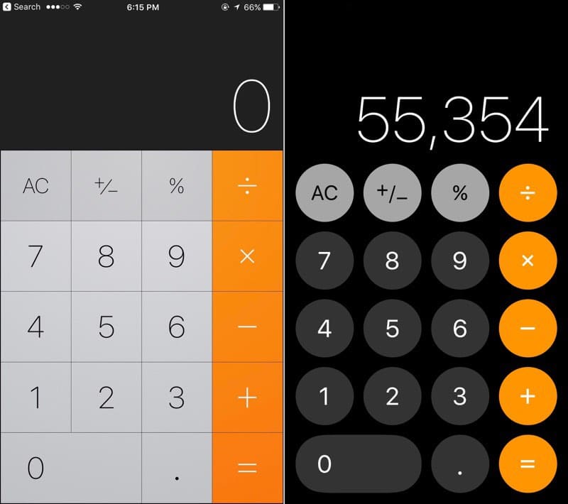
Redesigned both the icon and the application interface itself.
The icon is more retro-styled and the app interface looks more like the dial pad for the Phone app.
11. Application interface 'Video'
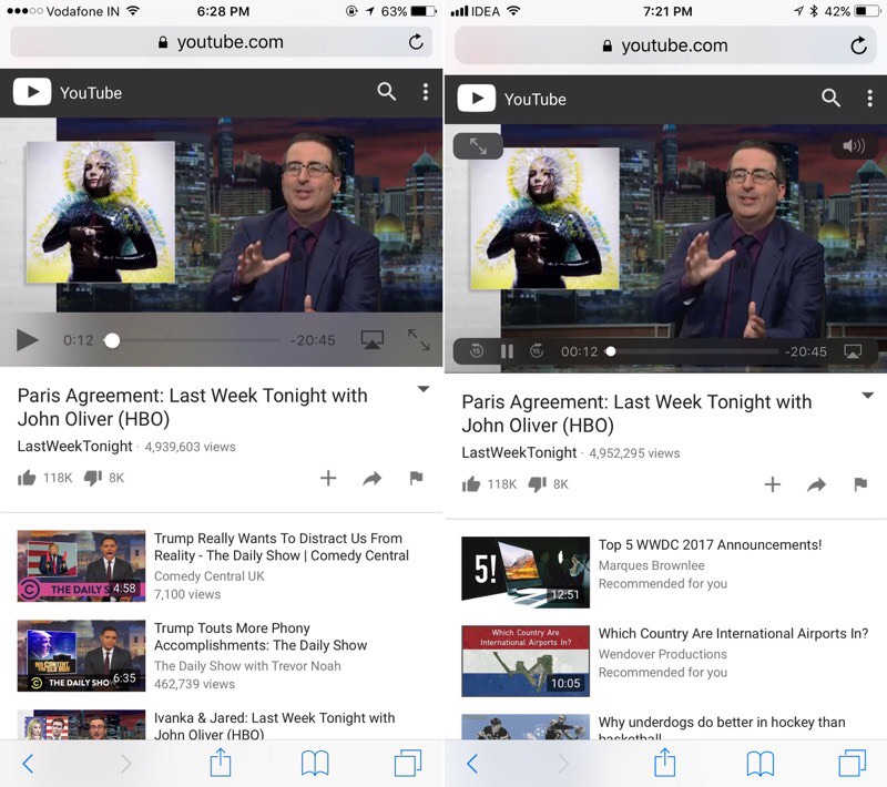
The stock application 'Video' in iOS 11 received a visual change in the interface.
 The top and bottom of the video player now use the floating panels style instead of the frosty glass style. iPad will now have more intuitive buttons for switching to picture-in-picture mode and for enabling AirPlay mode.
12. Redesigned app 'Settings'
The top search section of the Settings app has gotten a larger panel, which is typical for the page with a list of options in the Settings app, as well as for some high-level service pages, such as the Control Center.
13. Redesign of the status bar
The cellular signal strength icon has changed. Now the signal level is displayed in sticks, rather than dots. The location icon now appears as an outline instead of a shaded icon.
14. Improved design elements of the 'Notes' application
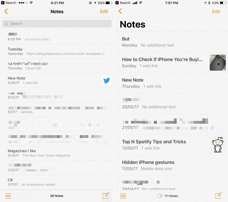
The Notes app now has larger headings and titles.
15. Improved design elements of the Safari application
The user interface of the Safari app is more voluminous, where the URL bar has grown by a couple of pixels. The text in the URL line got a little more padding from both sides.
16. Improved design elements of the 'Calendar' application
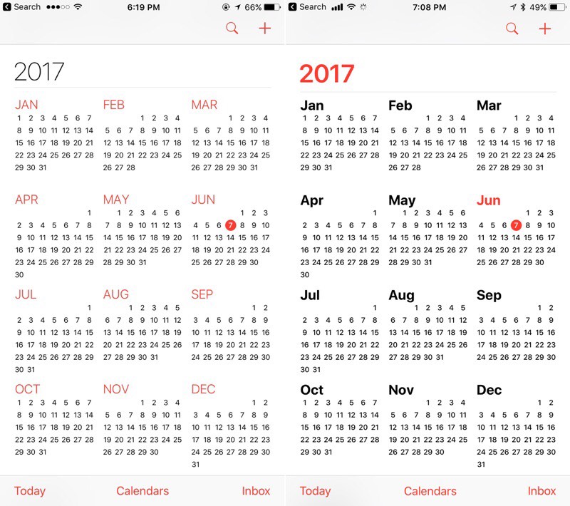
In the Calendar application, the Year line is now more expressive. Headings, again, have become larger and do not invade the text space.
17. Section on disk space management
The 'iCloud & Storage' section is now named 'iPhone Storage'. Its appearance is more reminiscent of the style of a similar section in Mac OS, indicating the space occupied by data for applications, photos, videos, and more. The list of data also indicates the date of their last use.
18. Application panel in iPad
The application bar in iPad almost completely repeats the similar application bar on a Mac computer, it looks like a hover and is called up by swiping up at the bottom of the screen. More than six application icons can be placed, and recently used applications are displayed on the right side of the panel.
19. 'Slide Over' mode on iPad
'Slide Over' mode is no longer invoked from the right side of the screen. Now you need to hold down the application icon in the panel and drag it to the screen to open its data in a separate pop-up window over the current application that occupies the entire screen.
20. Switch between applications on iPad
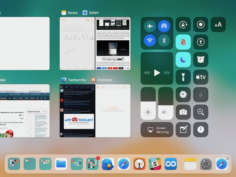
The switch between applications on iPad has been completely redesigned and now includes the application panel, and the Control Center, and running applications, and separate work screens.