In the three years since the release of the first Apple Watch, the company has significantly improved both the watch itself and the software for it. Remember how the notification bar took an incredibly long time to load and the Workout app refused to run in the background? This is all in the past. However, watchOS still has a lot of work to do.
This year Apple will host a WWDC event in San Jose in June, and a new version of watchOS is expected to be released there. We have compiled a list of improvements that we would like to see in this update. This is a long list, so we decided to break it down into categories.
- The convenience of use
- What Apple Watch can borrow from iPad nano
- 1. Combining Dock with App Loader
- 2. The button on the side should return to the main screen
- 3. Complication is too hard
- 4. Double tap to unlock
- 5. Convenient access to the Notification Center
- 6. Rejection of Force Touch in applications
- 7. Smart status bar
- How do you want to improve watchOS?
The convenience of use
Apple actually came up with a solution for the interface back in 2010 with the release of a new version iPod nano. The player has gone through many changes, but the sixth generation can be called one of the best – and it can be called the harbinger of modern Apple Watch. Some users liked the idea of wearing the miniature player on their wrist like a watch, and some companies even started making special straps and bracelets for this.
Usability was one of the main advantages of this model. Apple it was possible to combine here the multi-touch display from iPhone (now this is not unusual, but at that time the multi-finger touchscreen was new) with a miniature size iPod nano without sacrificing convenience.
And in some aspects iPod nano 6 is still more usable than modern ones Apple Watch 3.
What Apple Watch can borrow from iPad nano
The main screen iPad nano was a square of 4 icons with the ability to scroll through the screens, as in iOS. The designers Apple managed to reduce the number of important applications by combining the stopwatch and timer into one Clock application. In addition, Apple has hidden some of the least popular apps by default. If desired, users could add them to the desktop via Settings> Advanced.
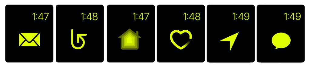
The main screen Apple Watch, on the other hand, is in complete disarray. The design resembles a bunch of frog caviar with lots of tiny icons all over the screen. They are inconvenient if your fingers are not very thin, and for people with poor vision, they are not the best choice. This mode is so inconvenient that Apple offered an alternative option in watchOS 4 – viewing all applications in a list.
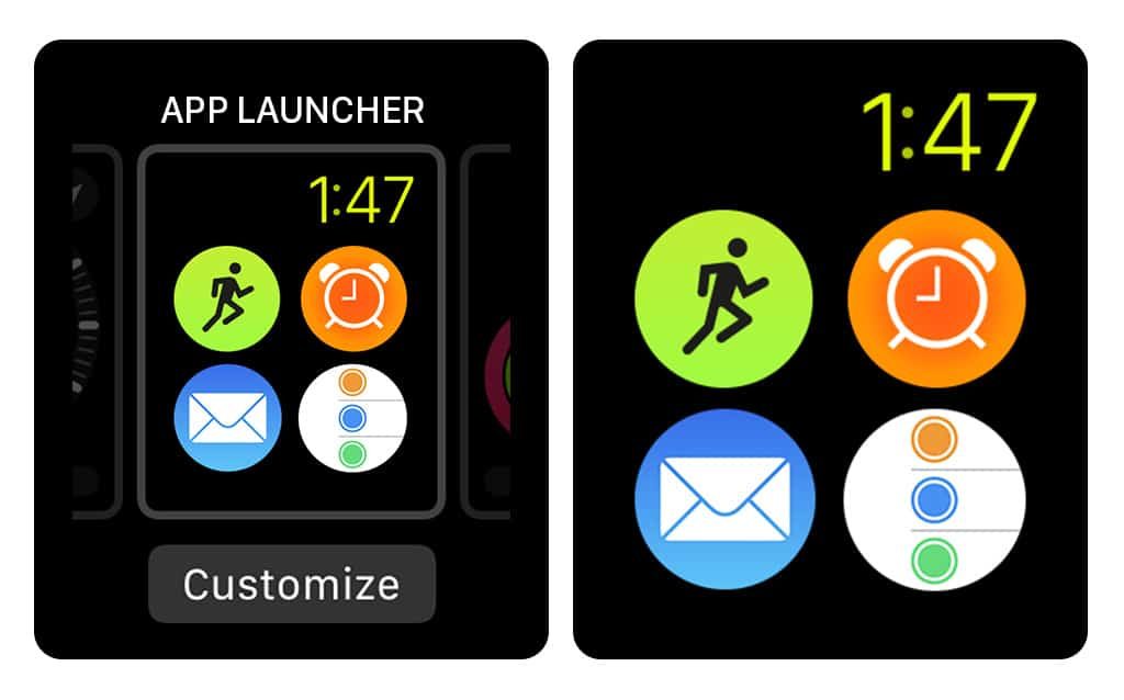
This itself was a confirmation that Apple acknowledged the existence of the problem, but he did not completely solve it. Apple also added two new ways to launch apps (the Dock and the App Loader), but this is overkill for such a small device that I would like to use more easily and intuitively.
The best thing would be to borrow the interface iPad nano and make it more modern, but given the number of updates released, this is hardly possible. So we will focus on what developers can do without changing the interface completely.
1. Combining Dock with App Loader
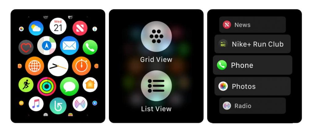
In list view, the App Loader looks a lot like the Dock. Both are lists of apps that you navigate through the Digital Crown. The main difference here is that the Dock shows your favorites and recently launched applications, while the Downloader shows all installed ones. The Dock also offers miniature app previews (this was added in watchOS 3), but when scrolling vertically in watchOS 4, they are half hidden, making the whole idea almost useless.
 App Loader (left) and Dock (right)
The solution here is trivial: just merge the two lists, while putting your favorites and frequently used applications at the top. To keep the list from getting too long, you can also add an Other (or Extras) folder, where the user can place rarely used applications.
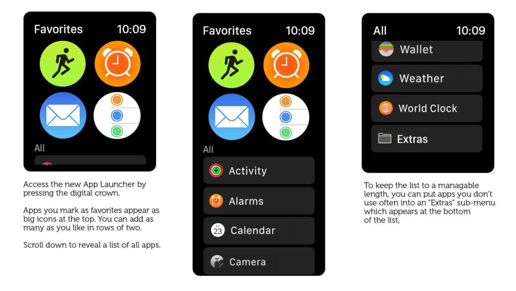 Dock Loader Concept
2. The button on the side should return to the main screen
One of the main problems with the interface Apple Watch is that it is illogically difficult to return to the main screen. This is by far the most important screen Apple Watch – it's a clock after all. You can easily access the App Downloader with a single click on the Digital Crown. At the same time, returning to the home screen requires a few taps. Agree, it sounds completely wrong!
When Dock and Bootloader are combined, the side button is released. And it would be better Apple at the same time to make it so that one press transfers directly to the main screen. Pressing twice will still activate Apple Pay.
3. Complication is too hard
Like widgets, Complications present a small amount of information in a limited area of the display and, when clicked, lead to the corresponding application. But the Complications are too small, and updates for them are extremely rare, there that the developers are not particularly trying to make something interesting out of them.
There are currently 6 types of Complications. Ideally, developers should design and format each one individually. However, most of them are not worried about it, and Apple seems to have a shortage of ideas. As a result, they look something like the image below.
It would be great if Apple designed the Loader in the style of iPad nano, with two rows of two icons each. In this case, the user could choose himself which application to place in each of the slots. Considering that standard icons would be used for this watch face, third-party developers would not need to spend time supporting this feature.
 Dial concept in iPad nano style
With this mode, you can access your favorite applications with a simple swipe to the right from the home screen – with cute, large and handy icons.
4. Double tap to unlock
Another cool feature of the sixths iPod nano was the dedicated on / off button to help avoid accidental touch screen taps. Many users Apple Watch complain of constantly accidentally launching apps. This usually happens due to inadvertent clicking on Complicate in the corner of the screen.
Even worse is the Digital Crown, which is constantly pressed when you bend your wrist back. As a result, while working out in the gym, you can accidentally press this button by calling Siri, which will immediately ask how it can help. How I wish it would help the developers get rid of this problem!
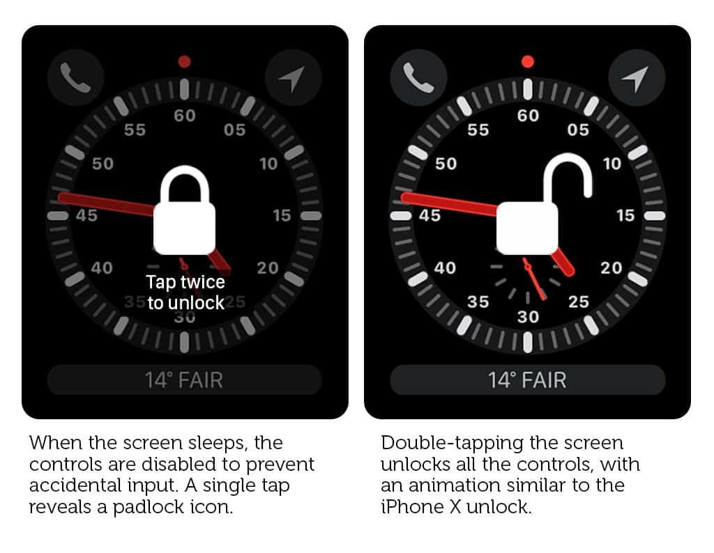 Automatic display lock concept
To do this, you need to add a way to lock the screen when it is turned off. It will still light up when you lift your wrist, but you will need to unlock your device first to use the screen or buttons. In this case, it is necessary that the gesture for unlocking be both simple and such that you do not accidentally make it. A double tap is excellent for this purpose.
5. Convenient access to the Notification Center
For most users, notifications are one of the most important features Apple Watch. Therefore, it is rather strange that you can only access the Notification Center from the home screen (which itself is difficult to access – see point 2).
In the case of the LTE version Apple Watch Series 3, this drawback is perceived especially strongly. So, during a workout, you can quickly see if the red dot at the top of the screen is on, signaling new applications. The problem is that this point is not displayed directly in the Training application, although there seems to be plenty of room for this in the interface.
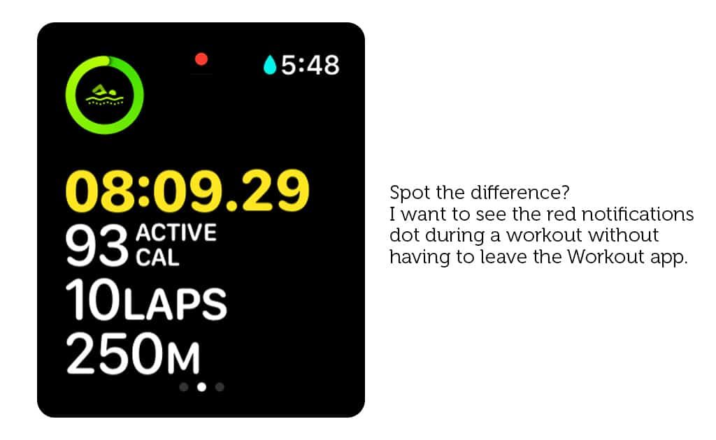 Concept: a point showing the presence of new notifications in the Workout app interface
It would be great if this point was available at the system level, regardless of the current application. It is also worth adding a universal gesture that would display the Action Center on top of any application. Perhaps, at first, users will confuse the new gesture with scrolling the screen, but over time it will take some getting used to.
6. Rejection of Force Touch in applications
Force Touch has never been a particularly useful feature. It was originally designed to bring up context menus on Apple Watch – and that's all, for third-party application developers could use it, thanks to the limitations in WatchKit.
Initially Apple believed that developers would use context menus to create simplified miniature applications that could be used without opening the main one. However, the most convenient way to apply this model was, on the contrary, simple monosyllabic actions. So it's easier to transfer this functionality to more familiar swipes than to force use Force Touch, the existence of which not every owner remembers Apple Watch.
Whether you like Force Touch or not, the reality is that almost no one uses it these days. Even in the Workout app, it was replaced with a swipe to the right. So it seems that now is the time Apple to urge developers to abandon Force Touch in their applications, so that in the future they can get rid of it at the hardware level.
7. Smart status bar
To conserve battery power and standardize app usage, Apple allows only three types of apps to run in the background: audio recordings, walkthroughs, and fitness apps. When one of these apps is active in the background, you will see a small icon on the home screen. Clicking on it takes you back to the app. But it is so small that it is difficult to hit it. Also, it doesn't tell you any information from the background app. The last problem is that, again, it only appears on the home screen and not on top of other open programs.
In iPhone background processes such as active phone calls, personal hotspots, or screen recordings are displayed with a colored status bar. Something like this would be very useful in watchOS as well.
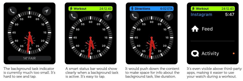 Concept: a status bar on top of the main display and a third-party application (on the left – the icon for returning to the Workout application in watchOS 4)
The status bar can be highlighted in green if a workout is active in the background, and it would display the elapsed time since the start of the activity. The audio recording would be displayed as a red bar with the recording time. And step-by-step instructions can be marked with a blue bar showing the remaining time. The timer can receive a similar update so you can see the remaining time without returning to the app.
How do you want to improve watchOS?
Do you have any ideas on how to make the interface Apple Watch better? Share your opinion in the comments!